
Share
Introduction
Despite first being launched on January 3rd, 2009, Bitcoin had no market value until over a year and a half later, first trading for around 5 US cents in July 2010. Just over 13 years later, a single bitcoin was worth approximately US$39,000 - a growth of just under 80 million percent (80,000,000%) since its inception.
When looking at the evolution of Bitcoin’s price, a simple linear time series imperfectly characterises it as highly volatile and unpredictable. As a result, there is no shortage of misconceptions on the historical path of Bitcoin.
This article explores how using a logarithmic scale allows us to more accurately interpret the growth of Bitcoin’s price, especially the first 8 years, which look largely uneventful on a linear scale as illustrated in the figure below. This is because Bitcoin’s historic growth has been exponential in nature – which we will soon discover is perfect for a logarithmic visualisation.
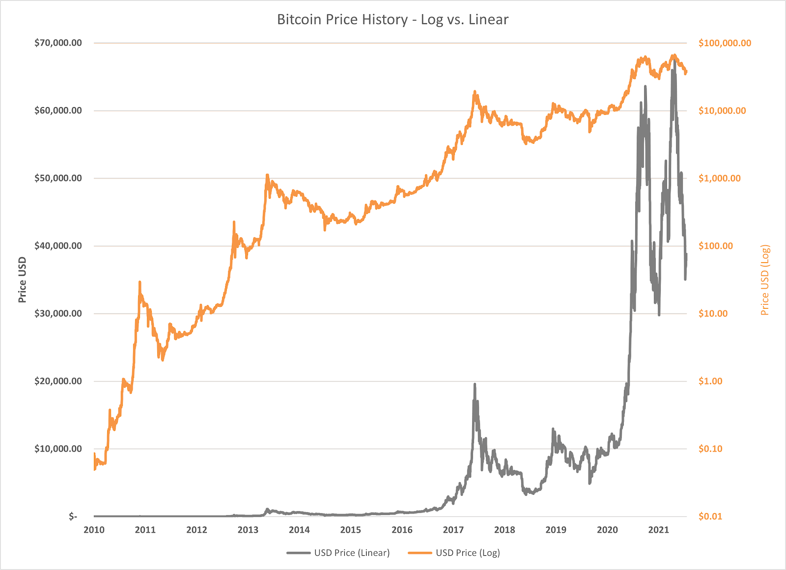
Looking at Bitcoin on a linear scale shows a highly volatile asset that one might logically try to avoid. Looking at it on a semilogarithmic chart (i.e. y-axis in log scale, x-axis in linear scale), however, shows sustained exponential growth for patient, convicted investors for well over a decade, with all major recent corrections (53% April to July 2021, and 47% November 2021 to January 2022) being relatively less impactful.
The Logarithmic Scale
Logarithmic Vs Linear Scale
The arithmetic scale, more commonly known as the linear scale, is the scale that most charts tend to be presented in. It allows us to interpret absolute movements over time. However, this is not the only method to visualise data, nor is it always the most effective method.
The logarithmic scale, unlike the linear scale, is divided by orders of magnitude - usually a factor of 10. This makes it possible to compactly display numerical data with a wide range of values, where the numbers 10, 100 and 1000 are all equally spaced on the scale. In this case, the interpretation of one equal unit movement across the scale corresponds to a constant percentage change of 1000%, or ten-times. When only one axis uses a log scale, the chart is referred to as semilogarithmic.
The practical applications of logarithmic scale extend outside of strict data visualisation. Most notably, the Richter scale, which measures and classifies the intensity of earthquakes, uses the same approach, where each unit jump in magnitude indicates a tenfold increase in amplitude.
When is a Logarithmic Scale Preferred?
Essentially, data that is visualised logarithmically shows the viewer the rate of change over time, which is particularly useful when one is concerned with percentage movements rather than the absolute change. This is highly intuitive as well; it makes little sense to compare, for example, a 1 unit change at 1 unit (a 100% change) versus a 1 unit change at 1000 units (a 0.1% change).
This isn’t a new idea in the world of financial markets. In their 1978 book, Elliott Wave Principle: Key to Market Behaviour, A.J Frost and Robert Prechter note that “the correct method for tracking the stock market is to use semilogarithmic chart paper”. A rather relevant application of this method is in the analysis of Amazon’s stock price (or, similarly, any of the other trillion-dollar tech stocks like Apple or Google) which grew exponentially from around $1 to over $3300 in just a few decades.
The use of semilogarithmic charting is also commonplace when visualising data displaying exponential growth patterns over a long timeframe, such as population or the uptake of technologies. This is because linear graphs understate the whole picture of growth, making it near impossible to analyse earlier data points in the series due to the large range of values.
In The Context of Bitcoin
Before we investigate Bitcoin on a logarithmic scale, it is useful to understand how it has grown and why its performance justifies the use of a semilogarithmic chart. Bitcoin, like many prior exponential technologies, has grown rapidly, closely following an exponential pattern. Because of this, visualising its price performance over time on the arithmetic scale essentially only places focus on the last 3 years, with what appears to be a remarkably volatile period.
How Can We Explain This Pattern of Growth?
Bitcoin’s price trajectory more closely represents exponential, rather than linear, growth and there are several contributing factors. In our piece titled How to Value Bitcoin, we briefly discuss the principles of Metcalfe’s law, a concept used in telecommunications in which a network’s inherent value is equal to the square of the number of nodes in its network. Though Metcalfe’s law is an oversimplified approach and an imperfect single valuation method for the digital asset, it is still useful to conceptualise Bitcoin as a network, connected by the users who adopt its technology. As more users join the network, there is more value that can be derived from using Bitcoin. For example, a consumer is able to extract greater use from Bitcoin when there are more business owners that accept it as a form of payment and, in the same vein, businesses benefit from accepting Bitcoin when there are more customers willing to pay with it. Bitcoin’s adoption may thus be compared with the spread of other exponential technologies, including many that Bitcoin has been built upon, like the computer or the internet.
If other exponential technologies teach us one thing, it is that continued technological advancements are likely to be a key driver of Bitcoin’s growth and adoption. This is because Bitcoin is, in itself, a product of technologies that came before it and both enables and is supported by future technologies and networks that build upon Bitcoin’s foundation. This is comparable to how the invention of the computer inspired and necessitated the integration of the internet into its technology in order to support connection and productivity between computers and their users. As computers and networks improve and become even more widely adopted, this may also benefit Bitcoin and its adoption.
This phenomenon is commonly described through an S-curve adoption framework:
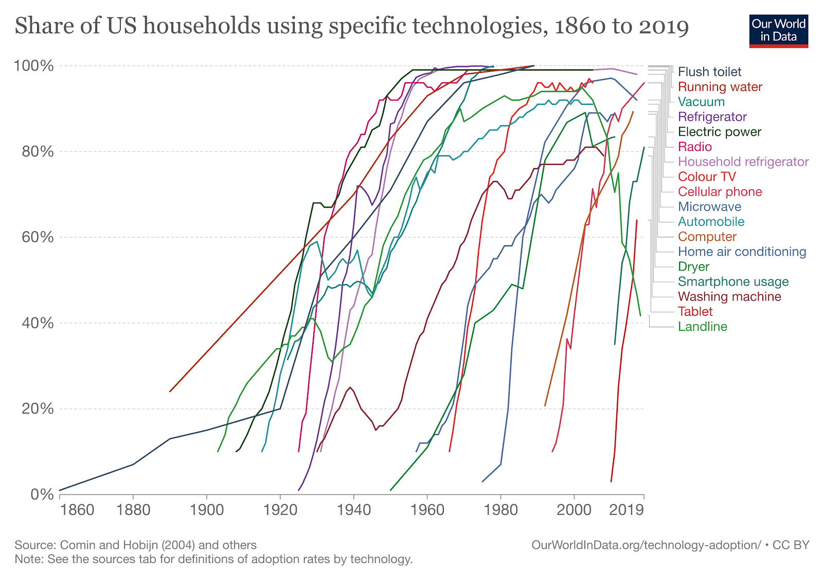
There are 2 factors worth noting in the figure above; each of these technologies’ curves follow an ‘S’ shape where adoption increases exponentially and newer technologies are adopted consistently faster than the technology before it. For example, note that it took almost half a century for radio to reach full adoption, but just a fifth of that time for the cellular phone. This rise in the rate of adoption is a reflection of the reduced need for infrastructure to support newer technologies and also of the current consumer: more connected, fast-acting, and more willing to embrace innovation. As an emerging technology, Bitcoin was largely unheard of only a decade ago, but is now frequently referred to in the mainstream media, and appears to be following the same S-curve adoption pattern.
In support of this, the number of Bitcoin addresses has demonstrated significant growth, with addresses holding a non-zero balance having grown by over 20% from 2021 to 2022 to approximately 39 million. However, the number of addresses does not necessarily reflect the number of unique users, nor does it imply how active they are; there is no single indicator alone that can accurately estimate adoption. As Bitcoin exists within the global economy, it is important to also note that the pace at which Bitcoin is adopted is likely to differ between countries and demographics and ultimately we cannot assume in our analysis that every household will, in future, adopt Bitcoin. Despite the lack of consensus however, within the technology adoption framework, adoption is more than likely characterised by its earliest phase: the innovators phase.
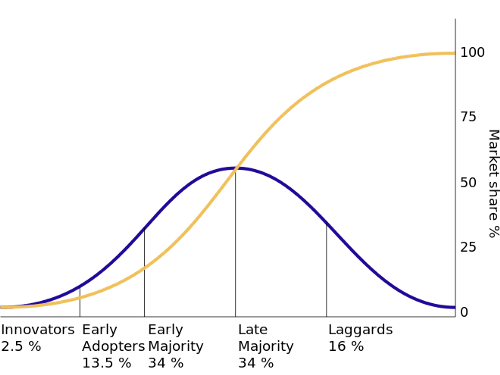
This small slice of the population to first adopt Bitcoin are known as the innovators - those who are adventurous and willing to try new things. As depicted by the graph above, this phase tends to grow relatively slowly compared to the next phase of users. The most critical phase to the success of the technology is the early adoption phase, where we observe the steepest increase in a technology’s adoption, which continues until the early majority join to hit the 50% tipping point. Once this point has passed, a gradual slow down in growth is observed as the late majority and finally the laggards adopt.
As mentioned previously, Bitcoin’s adoption, whether that be by consumers, merchants or institutions, is underpinned by the culmination of older technological infrastructure like the internet and smartphones. However, it also benefits through continuing technological innovation which may enhance the network effect. In particular, the ease with which bitcoin can be acquired, noting the rise in on-ramps to acquire Bitcoin (e.g. digital currency exchanges; Bitcoin ATMs; exchange traded products), as well as technological solutions addressing cyber-security, have played a large role in Bitcoin’s adoption. As long as improvements in the technological space continue, such as the latest Taproot upgrade implemented in mid-November 2021, the further adoption of Bitcoin may continue.
As a result, Bitcoin’s long term price performance is a reflection of its steep adoption curve. However it is important to note that this isn’t the only driver of Bitcoin’s growth as an asset. Among other drivers, such as increased or improved regulatory oversight or improved education, there is an issuance schedule that halves approximately every 4 years. Assuming demand remains stable or increases over time, this means that such demand is met with an ever-decreasing rate of supply. With the protocol capping the number of bitcoins to ever be mined at 21 million, this type of S-curve adoption pattern ultimately is best measured by the use of the logarithmic scale.
What Can We Deduce From Bitcoin On Log Scale?
A linear visualisation does not provide relevant information on Bitcoin's price evolution because investors are generally concerned with returns (i.e. percentage gains or losses) rather than absolute price changes. Consequently, we are presented with the ideal conditions for using the logarithmic scale. What was once a flat, and seemingly uneventful line that persisted until 2017, is now better visually represented with its upward-sloping curve.
The logarithmic transformation indicates to us that the rate of change over time can be characterised by a weakly increasing trend. That is, a curve that is rising but gradually becoming flatter over time. What is particularly worth drawing attention to is how Bitcoin’s seemingly extreme fluctuations in absolute price in the last year appear hardly volatile in comparison to our log-scaled curve. Indeed, the curve is smoother and now we can sensibly compare and interpret peaks and falls in price across time.
However, this is not to say that Bitcoin has not been volatile nor that it has reached a point where price changes are flat. In its early years, Bitcoin holders would have experienced some of the greatest volatility as depicted by significant percentage movements in and around 2011, 2013-2014, and 2018-2019. Despite this, we can see that an investor that purchased the digital asset just before any of its price drops during noteworthy peaks in 2011, 2014 or 2017 would still be in a positive position on their investment. In comparison, recent fluctuations are relatively small to these historic price movements. Thus, periods of short term volatility aren’t as significant to the long term investor as they are on the short term trader.
Conclusion
The most appropriate way to view Bitcoin’s price over long periods of time is on a logarithmic scale. A traditional linear scale mischaracterises growth and this is because Bitcoin growth follows the same rapid adoption growth patterns we have seen in new network technologies such as the radio or the internet. This necessitates the use of a logarithmic visualisation in order to analyse percentage changes in price rather than absolute movements. It is only through the logarithmic lens that we can unlock the bigger picture.
The content, presentations and discussion topics covered in this material are intended for licensed financial advisers and institutional clients only and are not intended for use by retail clients. No representation, warranty or undertaking is given or made in relation to the accuracy or completeness of the information presented. Except for any liability which cannot be excluded, Monochrome, its directors, officers, employees and agents disclaim all liability for any error or inaccuracy in this material or any loss or damage suffered by any person as a consequence of relying upon it. Monochrome advises that the views expressed in this material are not necessarily those of Monochrome or of any organisation Monochrome is associated with. Monochrome does not purport to provide legal or other expert advice in this material and if any such advice is required, you should obtain the services of a suitably qualified professional.
Related Articles

How to Value Bitcoin (2024 Update)
Valuing Bitcoin can be a challenge as, due to its abstract nature, there is “nothing to relate it to.” However, by shifting the lens through which we view Bitcoin, we can arrive at compelling theories through Metcalfe’s law, Stock-to-Flow, cost of production, market sizing and relating it to a technology start-up. Taken together, the following valuation models can be useful, though individually insufficient. Each model hosts criticisms, accommodating for improvements and adaptations.